TheManaDrain.com
January 08, 2026, 01:43:38 am *
Welcome, Guest. Please login or register.

Login with username, password and session length
News:
 
   Home   Help Search Calendar Login Register  
Pages: [1]
  Print  
Author Topic: What's Your Favorite? Worst Card Art Edition  (Read 9413 times)
Bill Copes
Adepts
Basic User
****
Posts: 925

I don't have an avatar. I am an avatar.

zebraturbosled
View Profile WWW Email
« on: February 11, 2013, 09:45:50 am »

In an attempt at levity and just because, I present the first (and maybe only) What's Your Favorite? thread!

So this time I ask, what is your favorite Worst Card Art?  Post a picture.  If you feel like it, tell us why you think it's awful.


So this one has always caught my eye:


What in the ever loving fuck is going on here?  A Bird-head-mank sporting an outfit made of purple centipede, rocking heavy metal hands with ice and pyrotechnics? Looks like an indestructible aura to me.
Logged

I'm the only other legal target, so I draw 6 cards, and he literally quits Magic. 

Terrorists searching in vain for these powerful weapons have the saying "Bill Copes spitteth, and he taketh away."

Team TMD
A.-1.
Full Members
Basic User
***
Posts: 828


Team RST


View Profile
« Reply #1 on: February 11, 2013, 10:41:32 am »


This was one of the cards that had me saying 'WTF' when I first started playing. WHY DOES THIS CREATURE NOT HAVE FLYING? I have no problem with the artwork itself, but it's the artwork in combination with the text.


This is probably my least favorite Magic art of all time, but it was such a house back in the day when I didn't know any better. This and Drudge Skeletons baby. Regenerate all day.
Logged

Please make an attempt to use proper grammar.
The Atog Lord
Administrator
Basic User
*****
Posts: 3451


The+Atog+Lord
View Profile
« Reply #2 on: February 11, 2013, 04:30:37 pm »

Anything drawn by Justin Hampton. It's just really low-quality work.
Logged

The Academy: If I'm not dead, I have a Dragonlord Dromoka coming in 4 turns
nedleeds
Tournament Organizers
Basic User
**
Posts: 399


View Profile
« Reply #3 on: February 11, 2013, 04:45:25 pm »


Cavern of Souls naming ... Fungus ... no ... Demon ... no no ... FUNGUS.
Logged
Oath of Happy
Basic User
**
Posts: 288


View Profile
« Reply #4 on: February 11, 2013, 04:57:19 pm »


Cavern of Souls naming ... Fungus ... no ... Demon ... no no ... FUNGUS.

Wow oh wow! I did not know they made a card this awful! My least favorite art would probably be Dark Confidant. If they switched it with the original Sengir Vampire I would rock 4 of them in every deck I play.
« Last Edit: February 11, 2013, 10:16:40 pm by Oath of Happy » Logged
aahz
Basic User
**
Posts: 118


View Profile
« Reply #5 on: February 11, 2013, 08:35:32 pm »

Obviously the only correct answer is...

Because...you saw the picture, right?
Logged
quicksilvervii
Adepts
Basic User
****
Posts: 679


There will be water if Ka wills it.


View Profile
« Reply #6 on: February 11, 2013, 09:25:34 pm »

I'm just going to leave this here.


Logged

When there is no wind, row.
Nefarias
Full Members
Basic User
***
Posts: 932


NefariasAndy
View Profile
« Reply #7 on: February 11, 2013, 10:13:51 pm »


Very Happy


Not bad per se, but this felt like a good time to remind everyone that Portal 2 had a handful of cards with guns in the art.


So there's a fun story behind this one. The artist, Craig Hooper, was the AD for another WotC product, Netrunner. He asked the MtG AD at the time, Sue Ann Harkey, if he could get a commission for Mirage. She said okay, and gave him Crimson Hellkite. This is what came back. Harkey had promised Hooper that his art would appear in MtG, but this really couldn't be a dragon. So R&D came up with the idea of a Dragon Mask, hence the flavor text.
Logged

Team GG's

Quote from: Young Jeezy
This will be the realest shit you ever quote
Greg
Adepts
Basic User
****
Posts: 341


View Profile
« Reply #8 on: February 11, 2013, 11:26:14 pm »

I'm not entirely sure which direction this thread wants to go in. I would just like to point out here that there is a huge difference between art that somebody doesn't personally like or prefer, and art that somebody doesn't personally "get." There's a whole world of thoughtful, well composed and executed artwork that is of no interest to me, but I still can respect it as a fan of visual art.

As an artist, illustrator, art teacher, and student working towards a master's degree in art education, this is actually something that I think about and discuss with people frequently, both in and out of the Magic community. Smile

At first, I thought you meant, "pick out one of the worst cards in Magic history, and tell us why you like its art." In that case, I would have quickly run to my Wood Elemental stash and written up a dissertation on the matter.

Bill Copes, it seems as though you have no problem with the formal qualities of Indestructible Aura's artwork itself, but moreso some comical confusion over the conceptual qualities, which is fine, but a little different than what I initially thought this thread would entail. It definitely looks like the bird is rocking out pretty hard. It seems like a fitting illustration for an otherwise very strange card. The aesthetics of the illustration are also working brilliantly. (Great contrast, use of primary colors, overall composition of shapes.) I'd expect no less from Mark Poole. Smile

So that leaves me confused as to where the "worst" quality comes in. I'm not looking to combat your thread. That's not my intention at all. I actually really like the idea. I'm just wondering what you meant with the use of the word "worst." What's the "worst" about this? The aesthetics? The concept? The card's playability? Maybe you meant "weird," "avant-garde," or "unique" card art and concepts? Smile

I totally agree about Whippoorwill. The whole "not flying" thing has always been a favorite of mine. Mold Demon is hilariously bad as a creature, but I actually think the artwork is rather beautiful and unique.

To join in on the conversation, if we're talking about artwork that we love on an otherwise useless card, mine would have to be Alpha's "Ivory Cup." There's something, in general, about the extreme simplified, visual iconography of the old Vintage staples, such as the Moxen, Black Lotus, Ancestral Recall, Demonic Tutor, Mana Vault, Library of Alexandria, and so on. Something about Ivory Cup visually fits into the same category of simplicity. It looks as though it would do something broken and belong in the same company as Candelabra of Tawnos or Sol Ring.


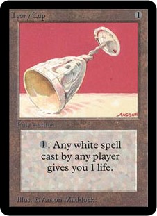
I'm a big fan of the shadows on the cup and the distinguished red shape made with the negative space of the background. The tilted composition for an otherwise symmetrical situation is a nice touch. I wish this card had an ability that made it fit into a Vintage deck somewhere. I mean, there's still the off chance that you could gain one life off somebody's Meddling Mage or Balance, right? Smile

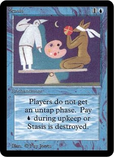
How long before we bring up the undisputed king of avant-garde Magic artwork? Nothing even comes close to the oddness of STASIS. Nothing screams "skip your untap step" quite like a mime and blindfolded coyote wearing boxing gloves balancing on a see-saw with a painter's palette floating in between them.

Logged
Greg
Adepts
Basic User
****
Posts: 341


View Profile
« Reply #9 on: February 11, 2013, 11:30:37 pm »

Volcanic Eruption marks another very strange moment in early Magic history. Could this card BE any more "red?" With the words "volcanic" and "eruption" in the name, a mostly red and black illustration of fire and volcanos, all while dealing X damage to all creatures and players while blowing up lands... most would not expect a blue frame on such a card. Wild!

Logged
StanleyAugust
Basic User
**
Posts: 279


View Profile Email
« Reply #10 on: February 12, 2013, 05:05:23 am »

Are you kidding me? Stasis is the coolest art ever!
Logged
Prospero
Aequitas
Administrator
Basic User
*****
Posts: 4854


View Profile
« Reply #11 on: February 12, 2013, 07:55:40 am »

Are you kidding me? Stasis is the coolest art ever!

Pretty sure that he agrees with you.

Logged

"I’ll break my staff,
Bury it certain fathoms in the earth,
And deeper than did ever plummet sound
I’ll drown my book."

The Return of Superman

Prospero's Art Collection
Bill Copes
Adepts
Basic User
****
Posts: 925

I don't have an avatar. I am an avatar.

zebraturbosled
View Profile WWW Email
« Reply #12 on: February 12, 2013, 10:02:17 am »

Quote
So that leaves me confused as to where the "worst" quality comes in. I'm not looking to combat your thread. That's not my intention at all. I actually really like the idea. I'm just wondering what you meant with the use of the word "worst." What's the "worst" about this? The aesthetics? The concept? The card's playability? Maybe you meant "weird," "avant-garde," or "unique" card art and concepts?

I mean any and all, sir.  I just wanted to start a nonsensical discussion thread Smile
Logged

I'm the only other legal target, so I draw 6 cards, and he literally quits Magic. 

Terrorists searching in vain for these powerful weapons have the saying "Bill Copes spitteth, and he taketh away."

Team TMD
Greg
Adepts
Basic User
****
Posts: 341


View Profile
« Reply #13 on: February 12, 2013, 11:51:22 am »

Are you kidding me? Stasis is the coolest art ever!

Pretty sure that he agrees with you.

Highly agreed! Stasis is very high on my list of awesomeness.
Logged
credmond
Basic User
**
Posts: 477


View Profile
« Reply #14 on: February 12, 2013, 02:19:58 pm »

What do I win?


Logged
Bill Copes
Adepts
Basic User
****
Posts: 925

I don't have an avatar. I am an avatar.

zebraturbosled
View Profile WWW Email
« Reply #15 on: February 13, 2013, 01:45:29 pm »

What do I win?


Champion of one of the universes of your choosing.

Great find -- I've never paid much attention to the artwork on this one.  Peeeeeerty bad, given the card context.
Logged

I'm the only other legal target, so I draw 6 cards, and he literally quits Magic. 

Terrorists searching in vain for these powerful weapons have the saying "Bill Copes spitteth, and he taketh away."

Team TMD
skirk1983
Basic User
**
Posts: 8


View Profile Email
« Reply #16 on: April 19, 2013, 07:45:05 am »

Yeaa that Flash art is very bad omg. Sad

Also Camouflage by Myfors isn't pretty either :\


Best regards

Skirk
Logged
Bill Copes
Adepts
Basic User
****
Posts: 925

I don't have an avatar. I am an avatar.

zebraturbosled
View Profile WWW Email
« Reply #17 on: April 19, 2013, 10:23:02 am »

Yeaa that Flash art is very bad omg. Sad

Also Camouflage by Myfors isn't pretty either :\


Best regards

Skirk

"The adventures of Ghost Elf, the Tubular Torso!"
Logged

I'm the only other legal target, so I draw 6 cards, and he literally quits Magic. 

Terrorists searching in vain for these powerful weapons have the saying "Bill Copes spitteth, and he taketh away."

Team TMD
Pages: [1]
  Print  
 
Jump to:  

Powered by MySQL Powered by PHP Powered by SMF 1.1.21 | SMF © 2015, Simple Machines Valid XHTML 1.0! Valid CSS!
Page created in 0.048 seconds with 20 queries.